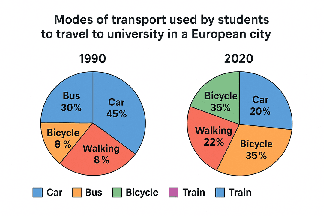
The pie charts below show the percentage breakdown of transportation methods used by students to travel to university in a European city in 1990 and 2020.
Summarise the information by selecting and reporting the main features, and make comparisons where relevant.
Write to See your Score
Words: 0
No submissions yet